Clicker ERP
Define a model, get the app. An ERP where no screen is designed twice, dense enough for people who live in it all day.
-
0module screens drawn by hand
Every list and form is generated from the model's schema
-
16field types
Each with a form control, a list cell and eight states
-
2journeys
A water board's billing and a port clearing agency, on the same engine
The problem
Small and mid-size businesses outgrow spreadsheets and land in ERPs built for someone else. The screens are crowded, every module behaves differently, and adding a module means designing forty more screens.
Clicker is my own product. It is not a suite of apps but a framework that generates them. A module author declares the data; the API, lists, forms, filters and permissions are derived from it.
Constraints
- The law: if a change needs the renderer to know about a specific module, the schema is wrong.
- Renderers don't know where they live. A page, a peek or a future split view gets the same form.
- Deny by default. Every model, field and action needs an explicit grant, and every write is audited.
- Zero recurring cost until the first investor demo, built part time.
Decisions
The calls that make it feel like one product instead of forty.
01 The schema draws the screen
Each model declares its fields, groups, views and summaries once. The same renderers draw every list and every form. The products module appeared with zero frontend changes, which was the test the engine had to pass.
02 Density is the thesis
13px body, 34px rows with hairlines and no zebra, tabular figures in every number column, borders instead of card shadows. Power users spend the whole day here; consumer spacing wastes their screen.
03 One violet, because colour means something
The accent is ink violet so it never competes with green, amber and red, which carry status. Text contrast was measured, not guessed: 4.5:1 or better in light and dark.
04 An empty field never looks like data
An editable empty field says 'Set amount…'; a read-only one shows a dash; a real zero always shows as 0. It's tested in code, because an ERP that confuses nothing with zero is lying.
05 Peek, don't navigate
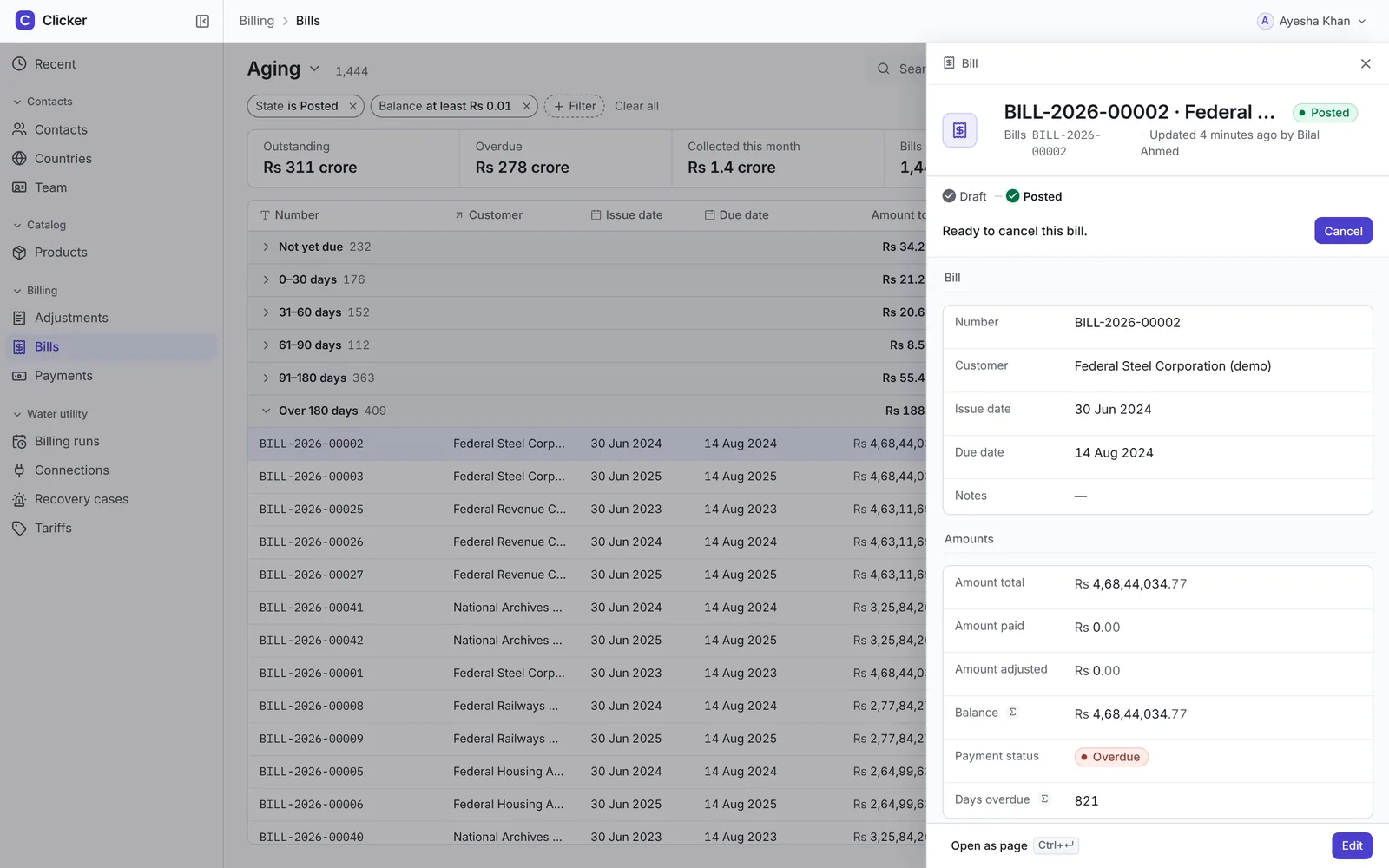
Clicking a row opens the record beside the list. The list keeps its place, the open row stays marked, and Esc returns focus to it.
Try it
These are real screens from the running product, captured from its demo seed. Pick a journey, step through the screens, and switch to dark.
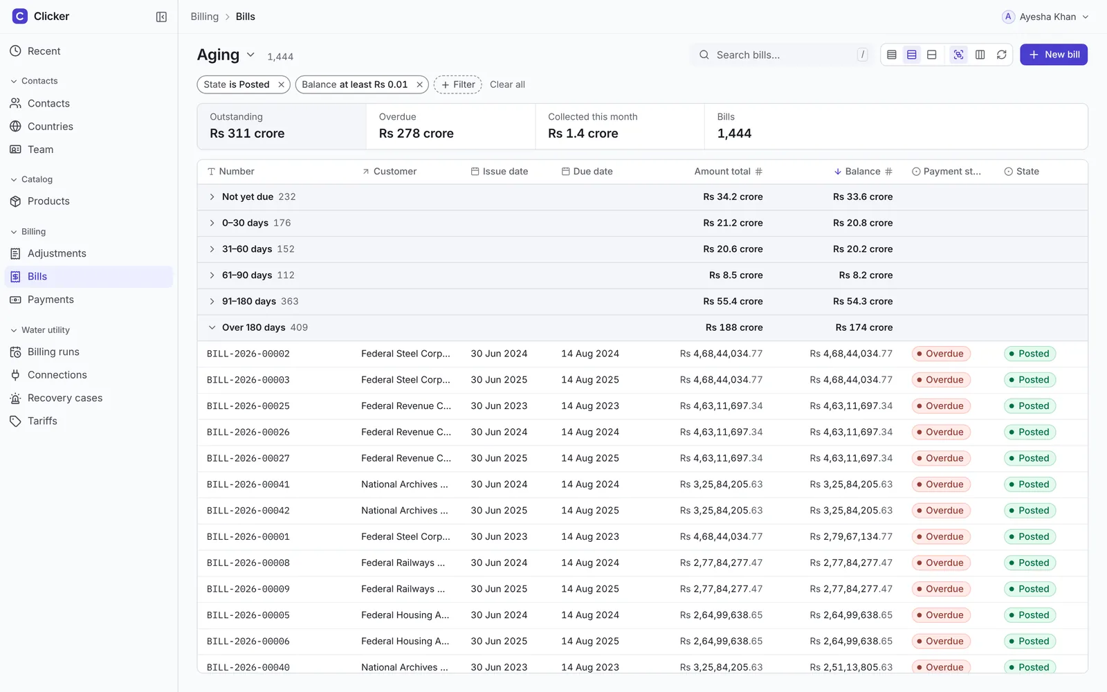
Aging. Bills grouped by how overdue they are, with totals per band and a summary strip in crore. One saved view, no custom screen. Signed in as a manager, demo data.
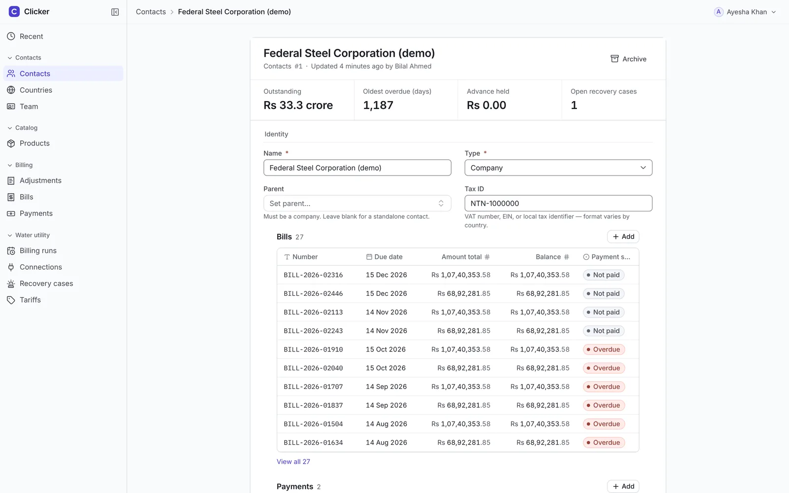
Customer statement. The contact record becomes a statement: outstanding, oldest overdue, advance held, and every bill and payment below it. Signed in as a manager, demo data.
Bill in a peek. Click a row and the bill opens beside the list. The list stays put, the open row stays marked. Signed in as a manager, demo data.
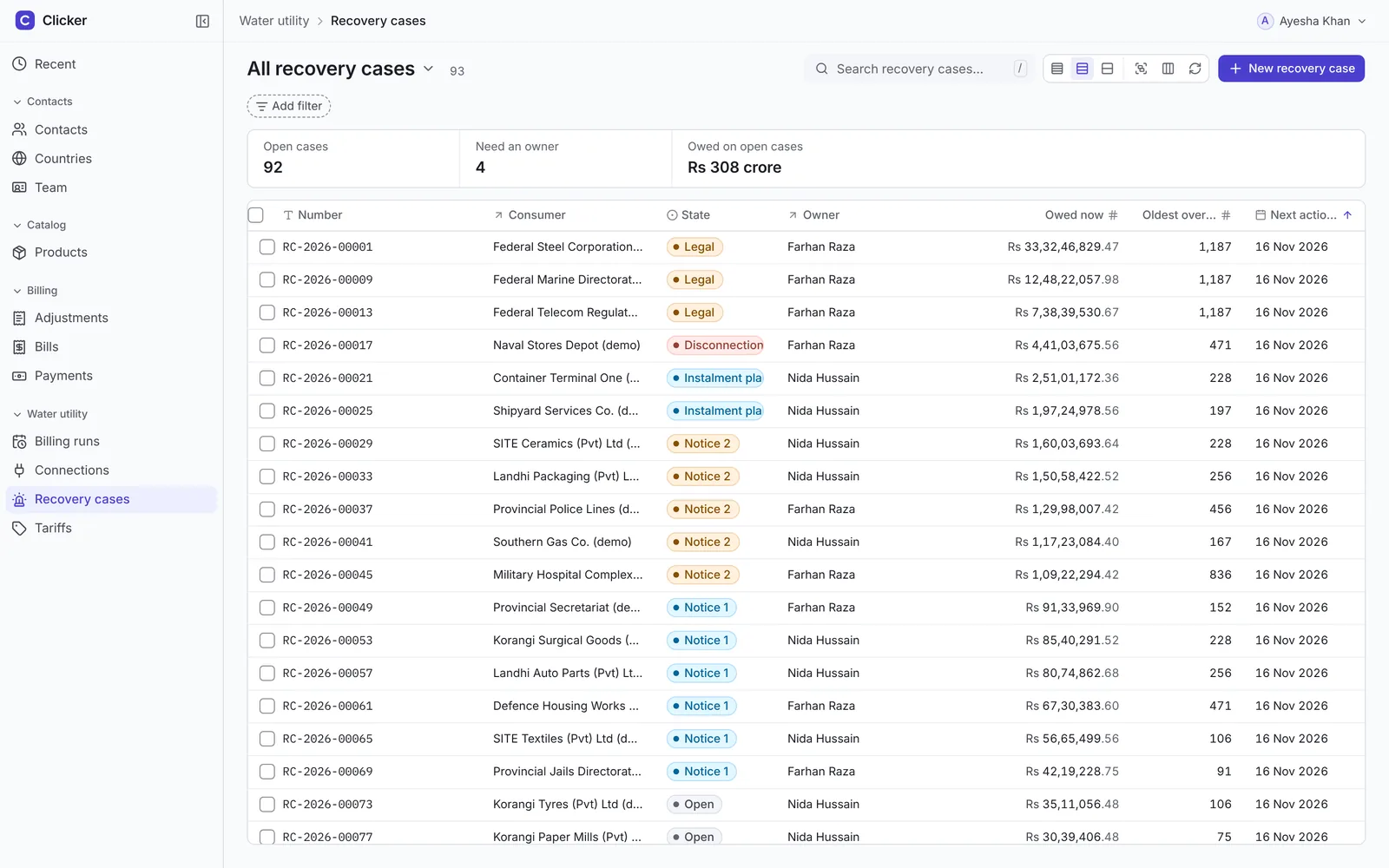
Recovery cases. Who owes, how long, which notice they're on, and whose case it is. Cases without an owner are counted at the top. Signed in as a manager, demo data.
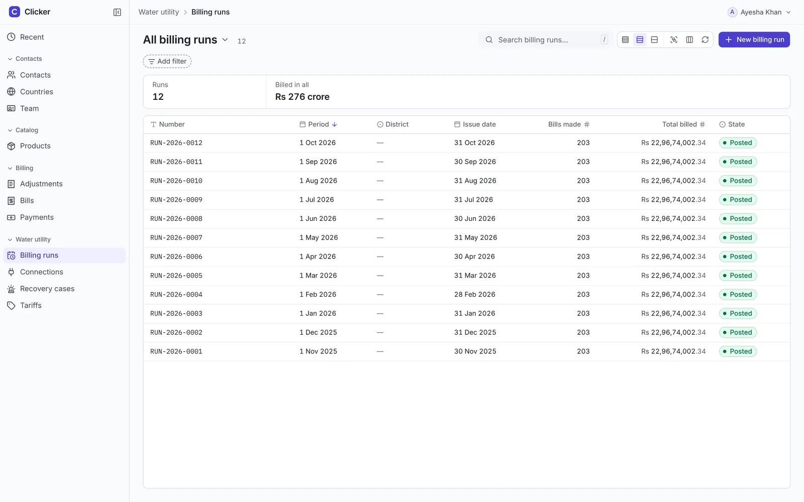
Billing runs. Each monthly run is one record: period, bills made, total billed, and its state. Signed in as a manager, demo data.
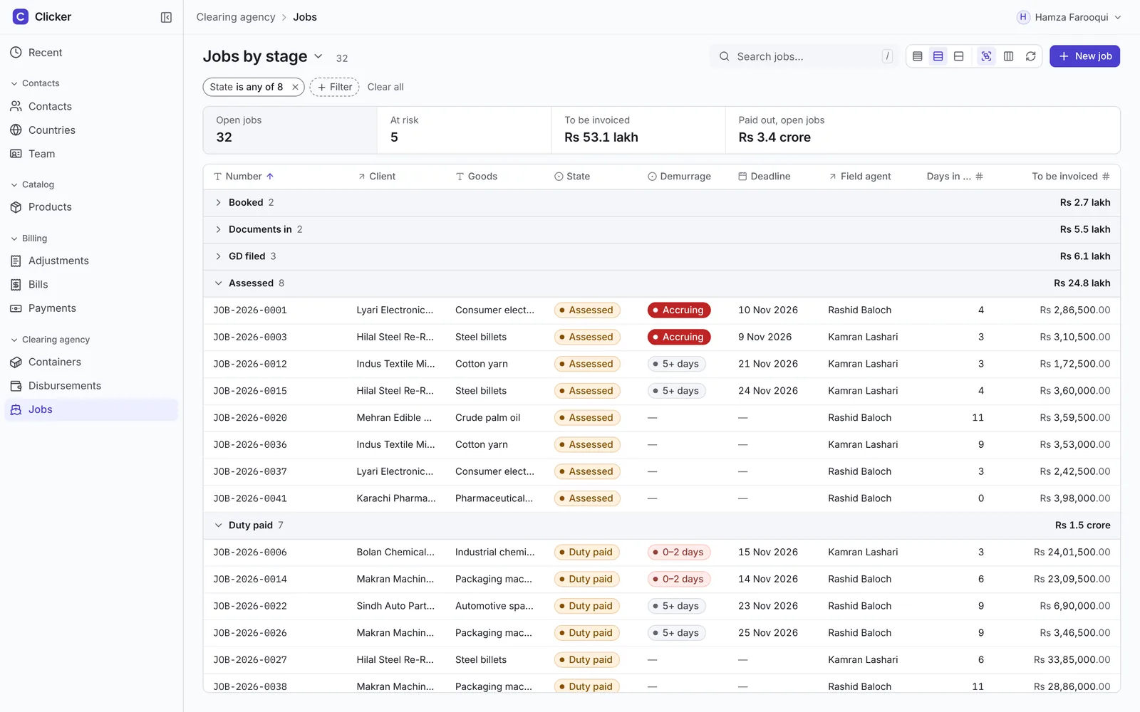
Jobs by stage. The pipeline as a grouped list: booked to closed, with what's at risk and what's ready to invoice on top. Signed in as the owner, demo data.
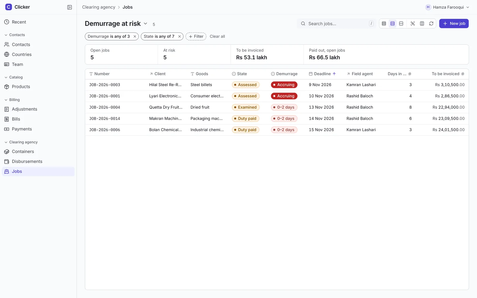
Demurrage at risk. Containers costing money by the day rise to the top, with the deadline and the agent responsible. Signed in as the owner, demo data.
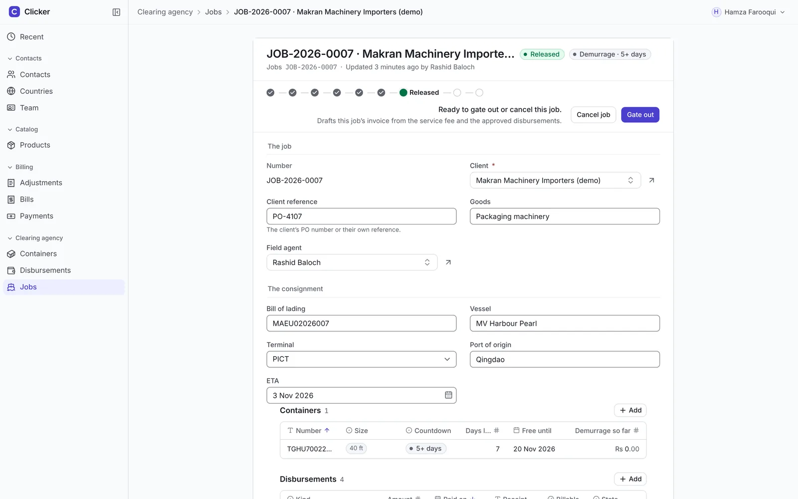
A job. Stage track, the next move in plain words, and the containers' free days counting down inside the record. Signed in as the owner, demo data.
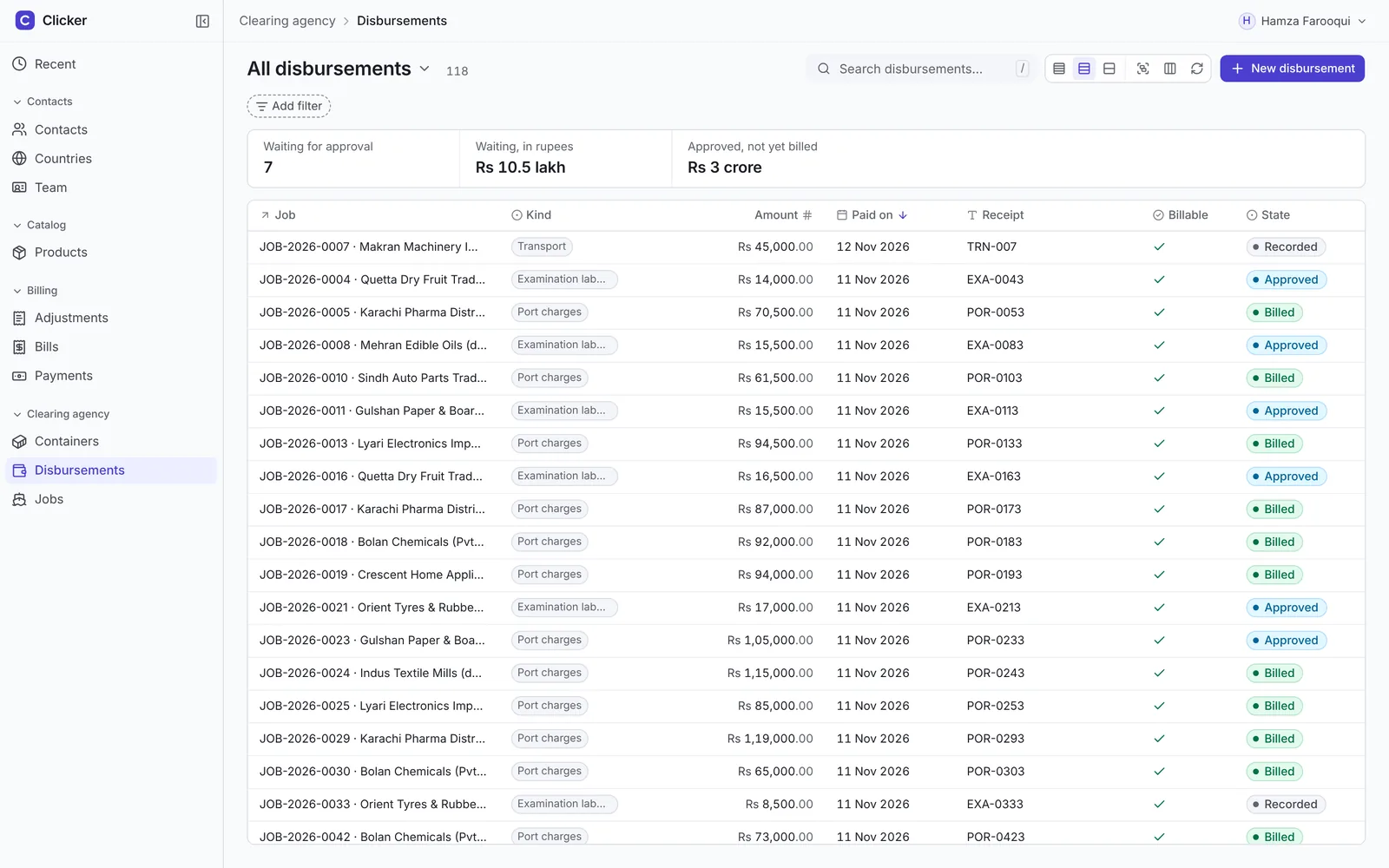
Disbursements. Money paid out on a client's behalf, waiting for approval before it can be billed back. Signed in as the owner, demo data.
Re-created for this page. It shows the pattern, with sample data.
Beyond the happy path
The states I check on work like this, because nobody asks for them until they break.
- Empty vs zeroPrompt, dash or 0, never confused
- Read-only vs disabledLook different on purpose
- Not yoursA record you can't see is a 404, not a locked screen
- Failed inline editRolls back and says why
- OfflineA banner and an undoable toast stack
- Financial reversalPosted documents are reversed, never edited
Evidence
- Two complete journeys run end to end on one engine, a water board's aging, statements and recovery, and a clearing agency's jobs, demurrage and self-drafting invoices.
- A rehearsal script drives both journeys through a real browser from a fresh seed before every demo.
- Light and dark, 1280 to 1920 wide, checked against the same screens.
- Every permission rule has a test that proves it denies.